Wednesday, 30 September 2015
Sound presentation
Background sound:
https://clyp.it/jezzhstu
WWW:
I think I was able to correctly present to the class the themes and ideas of contrapuntal and parallel sounds. The use of my "cinemagraphs" were unique and different as it successfully helped to present the themes and ideas that I had for my sound clip. This also made it easier than usual images and made it easier to explain as the images spoke for themselves. I was able to confidently present to the class by train of thought with the sound clip as I think the class was able to definitely understand my ideas. I also used a certain colour scheme for contrapuntal and parallel which was also effective.
EBI:
I think I could've used much more images than I had used in my presentation which could have helped to show more ideas and themes than I already had. This would've also shown that the sound clip was varied in the themes that it presented and it was not just for one static emotion but rather could be used for a much more wider range of feelings and emotions.
Best 3
Mamduh:
I loved the way he rotated and skewed his images to show a sense of destruction which was parallel to the sound clip that he used. He was able to use a simple instrumental and show how it can be interpreted in many different ways.
Abdirahman:
I think Abdi's use of the video clip was unique and also got the class interested into his presentation, it was also of a very famous movie called Reservoir Dogs which was directed by one of my favourite directors Quentin Tarantino.
Abayomi:
His presentation was very well thought out and he presented it with a clear thought structure and confidence which was evident in his presentation and his song choice. It was really clear to see the different themes and ideas that he could think of using his sound clip.
Friday, 25 September 2015
Lighting


Wednesday, 23 September 2015
Mise en scene
Scott Pilgrim vs the World

This is a still image of the opening title sequence from Edgar Wright's Scott Pilgrim Vs the World. The first thing that is very obviously caught by our eye is the name of the protagonist "Scott Pilgrim" in big, white, bright text. The font used looks electric which makes it look as if the text is sound coming from the band's guitars. The text arches over the band as if a welcome sign which appeals to the audience as an anchor.
In the foreground, we see a female and a male sitting down watching the band, who are in the background, playing their music. The way the room is un-naturally elongated creates an interesting illusion as if the two people are watching the font and NOT the band, this is because the font is IN FRONT of the band. This creates a sense that they are watching a movie and the band in the background is just playing the soundtrack.
The people are blurred and also because of the elongation of the room, it's hard to see the band. The only thing we can clearly see is the title sequence, so it suggests to the audience that it is the most important thing in the scene at the moment, as our eyes are drawn immediately and only to the title.
Avengers
The costumes used by the characters and actors help to reinforce to the audience the fact that they are all superheroes and that the movie is a Marvel superhero comic based movie. Each costume is unique to each individual based on their comic counterpart. The location of the scene displays the carnage and destruction of New York city with fires and destroyed cars everywhere. This helped to create sense of planetary invasion that our heroes were fighting against. There is a very grand scene where the team takes out the biggest alien ship, there is an overture in the soundtrack and a circular pan shot shows how they all stand together to fight against the surrounding enemies, which creates an over all heroic feeling. The scene also uses iconic one liners such as "Hulk Smash" to relate to it's audience.
Ace Ventura
This scene is very contrasting to the other movies as it is a comedy. Jim Carrey's character Ace Ventura wears a costume of very floral and bright coloured clothes to show off his eccentric personality. The actor uses over the top facial expressions to create comedic value and express general humour of simple things such as climbing down a ladder. He also references, or rather mimicks, popular fiction such as Star Trek to make the audience laugh and by creating jokes that everyone understands. The camera uses a low angle shot to show the vastness of the tank, and the so the camera is placed closer to the floor, which Jim Carrey uses to his advantage to get close to the camera and create some more humour.
The Pianist
The genre for this movie is completely different than the other two as it is mostly focused on drama and history. The storyline is generally very dark and grim because the movie revolves around the horrors of the war and how the Jewish people were mistreated by the Nazis in the second world war. This is reflected through the use of the setting and location as the over all background colours are very dark and grey. Another way this is reflected through the usage of the colours in costume for the different characters. However despite having dark coloured clothing, the characters still have some bright colours in their clothes which could suggest how they still have their humanity despite the atrocities committed by the Nazis.
Film Poster Analysis

Blade Runner
By looking at the poster, I can tell that it is a fast paced and action film. This is evident as the main protagonist is placed in the middle top of the poster. It is easy to tell that Harrison Ford is the main star of the film as his name on the poster is just as big as the title of the film. I can also tell that he is the protagonist because the picture of him is the biggest as compared to the other pictures. Due to the bright yellow colours used in the poster which allude to stars, I can tell that it is a Sci Fi film, also due to the fact that the prop used by the protagonist is a futuristic looking gun. It could also be a Sci-Fi film because Harrison Ford was an iconic character in the Star Wars franchise for which the genre is related to Blade Runner. The setting is also outside big futuristic buildings and with futuristic cars present. The idea of the film being an action genre is evident as the protagonist is facing away with a look of determination and also he is covered in sweat and possibly also due to the fact that the characters are shown in an inked fashion which could allude to a comic book type of illustration. He is also joined by a female character who can be assumed to be dangerous due to her use of the cigarette, which could lead to allusions of her being a "femme fatale". The woman's presentation is different to the protagonist as Harrison Ford's character is bright and surrounded by light whilst the female's character is cloaked in shadow to create a sense a mystery of her character and also the idea of the classic hero and villain narrative.
This film could possibly be aimed at a younger audience such as young adults or adults. It could also be a small independent film aimed for niche or art house cinemas.
 Scary Movie 2
In the mise en scene, you can see many characters sitting in the cinema watching a movie. The characters have a variety of comedic facial expressions and costumes. There is a review that let's us know how the movie is "Absolutely Hilarious!". This helps us to reinforce the idea that it is a comedic film. Also, we are also easily made aware that this movie is a sequel to a well known franchise as it's called "Scary Movie 2" and the tagline underneath the title uses the words "More" to suggest to it's audience that this movie is even better than the previous one.
I think the target audience might be teenagers or young adults as it's generally a comedic movie which could be watched by all. However, it might not be suitable for young children because the franchise is known for some explicit scenes.
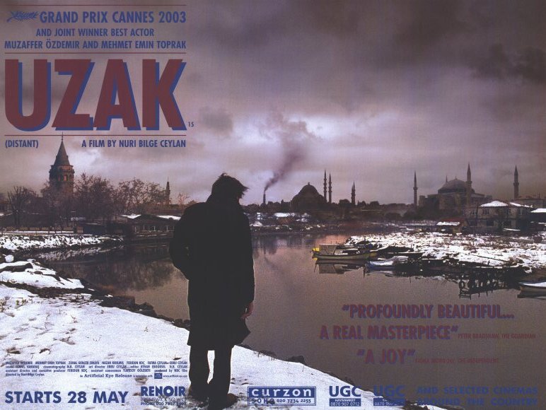
Uzak
The poster uses very dark and grim colours which also reflects the overall background and landscape that the man is staring at. This could allude to the idea that the story about war and general conflict as the entire landscape is ruined. There is also a subtle use of pathetic fallacy as the weather is very depressive which could allude to the overall theme of strife in the film.
This film looks like a documentary or drama with a very serious and dark tone.
I think the target audience is for a niche or art house cinema audience. As it is a foreign subtitled film and it isn't a massive blockbuster but rather a smaller and independent film.
I'm Not Scared
The title of the film could allude to the audience that the story is about a boy who is determined and trying to overcome his fears. The fact that the main character is looking down a huge hole creates some mystery and leaves the audience asking questions. The title is also a phrase often used by children as a self affirmation. It could also mean that the child is put in a scary situation and has to face the challenges by himself.
The poster doesn't give obvious hints to the genre, but it does create a sense of mystery like a thriller or suspenseful movie due to fact that the child is looking into the unknown which is the hole.
The film could be aimed at a younger audience of children because of the main character displayed in the middle of the poster who is a child. The shot up angle from the hole also looks very comical so it could appeal to young kids.

Sin City
The storyline could be about a gang in a city as all the characters are standing close together. The audience could also interpret that the leader of the gang could be Bruce Willis' character as he is the most prominent and is in front of everyone else. The protagonist has a unique pose as if he is shooting at someone that is lying on the floor. This could allude that the protagonist may or may not be a protagonist which makes the audience question the morality of the characters which could also link to the idea of sins in "Sin City".
The poster is designed in a very graphical format as if it is inked like a comic or graphic novel which is true as the film is based on graphic novel by Frank Miller. I think it is an action film due to the fact that all characters are holding guns and it could also be a thriller because of the use of the dark and gritty colours.
I think the target audience for this movie would be adults and people over the age of 18. This is clearly evident as all the male characters depicted in the poster are carrying guns which could reflect the possible abundance of violence in the movie. Also because the only two female characters on the poster have very provocative poses, costumes and facial expressions.
Pirates of the Caribbean: Dead Man's Chest

The poster follows the iconography of the pirate's era, this is evident as the main title of the film is displayed on a scroll of old and dirty parchment and the logo is a skull with cross bones. This immediately gives us the idea that this is going to be a pirate movie and also because there are two massive ships placed in the middle of the poster. The three biggest stars of the franchise have their images placed under their names to anchor the reader into watching the film, with the main star Johnny Depp's character using a prop that is a flintlock pistol which are specific to the pirate era.
The poster is also surrounded by jungle leaves and slight fog which creates a sense of mystery as it gives the idea of adventure and urges the audience to find out more about the film by watching it.
I think the movie and franchise is aimed at a family audience. It can be enjoyed by anyone as it has a mix of everything, from romance to comedy to action. It is a franchise that can be enjoyed by a family watching it together.

Bride and Prejudice
The two main stars are the main attractions of the poster,they give it a romantic feeling despite the fact that there is a lack of the colour red which could show that the film is not as passionate or romantic as conventional romantic films. This is also shown by the use of their facial expressions and their position of being back to back which could allude to the fact that there could be a clash like a typical romantic film of the main characters who don't like each other at first but end up falling in love.
The background is divided into two parts behind the main stars, the right side is of India which can be seen by Indian people in traditional costumes and the Taj Mahal. The Taj Mahal is an iconic landmark which easily helps the audience to distinguish that it is in India. The other side is shown to be a modern city which is represented with the American people. The people on either sides look like they are dancing which also makes the movie look fun to watch and it looks like a film for everyone to enjoy, this is further denoted by the colourful confetti.
The genre for this film could be that it is a romantic comedy and that the target audience could be people of a variety of cultures. It could be aimed at a family audience as many traditional Bollywood movies are.
 Million Dollar Baby
Whilst the poster does follow the common convention of having it's main stars on the poster with the protagonist taking up the most space; the poster is unusual in the sense that the protagonist has her back towards the audience. The audience doesn't get much of a story from the poster, but due to the pose of the protagonist and the fact that they are all surrounded by shadow, it provokes the audience into asking questions which can only be answered by watching the film. However, we can tell that both Clint Eastwood's and Morgan Freeman's character play a secondary role as they are in the background, it could also be suggested that Freeman's is a lesser character as his image is smaller than Eastwood's. Finally, we also see Hilary Swank's character in some kind of sports gear so we do get a small hint that the story could be sports based.
Due to it's use of the dark colours and monochromatic colour palette, it can be assumed that the movie is very dramatic and could possibly be a documentary.
It's possible that the serious tone conveyed in the poster could mean that the film is for adults because the lack of colour makes it unappealing to a younger audience and creates the allusion that the film's storyline will be dark and gritty.
Subscribe to:
Posts (Atom)