Research

The main title is clearly presented in the centre of the image and takes up the majority of the space to really stand out to the audience. This is very efficient in anchoring the target audience and making them read the brochure and get straight to the point of what it is that they are advertising.
The main central image is right in the middle and presented uniquely in this brochure. It's different and stylised an a way that it invokes the reader's attention to the detail and urges them to see the image with a different perspective. This is very unusual as the image is not clear at all and is edited with different colours but put into the text, this distorted effect breaks key conventions of making the central image clear and presentable and relates to the kind of reader that it is aimed it. The image is edited in a way to follow the colour scheme of the BFI logo which makes the brochure much more consistent to the branding.
Brochure Front Covers

This cover very effectively uses designs and vectors of film iconography which I would love to use.

This brochure uses an edit on the front cover which creates a very distorted and trance-like illusion effect which I would like to use as it fits our main plot.

This brochure has a very minimalistic and clean look to it and the use of the cuts in angled lines is very unique which would be effective in my cover.

The over exaggerated expressions help to engage the audience and I think this is something that I would like to use in my cover with my photoshoot.
Contents Pages
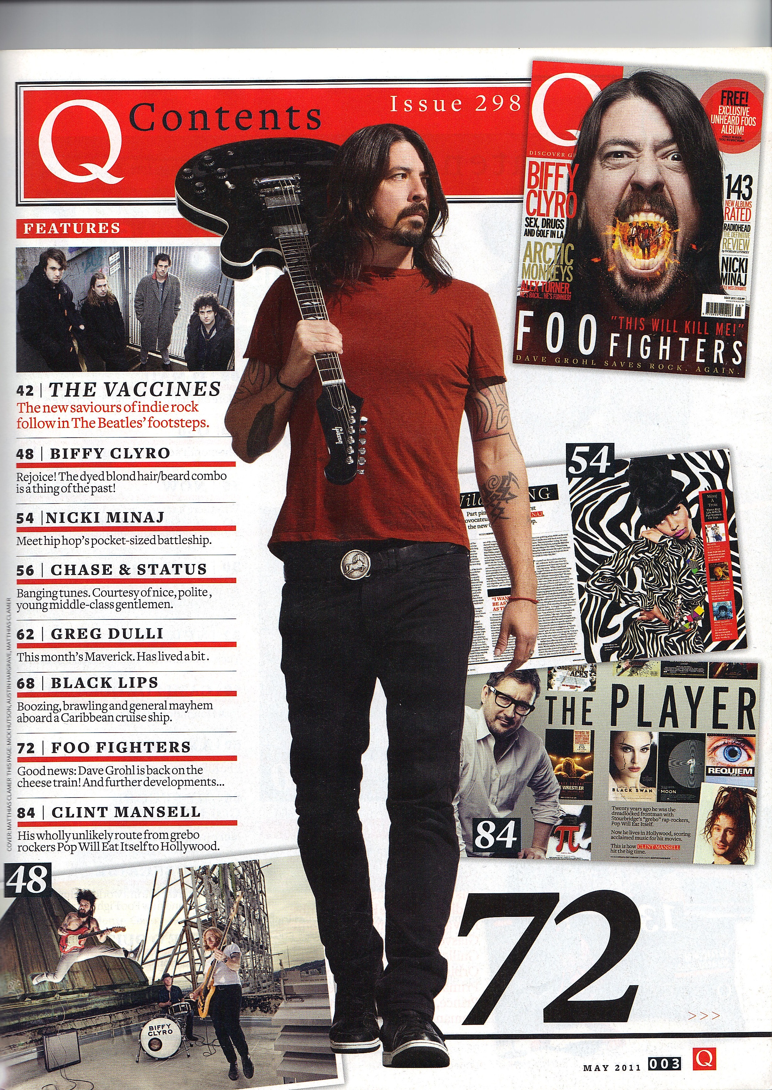
I would like to use the medium body shot of the main person with a prop over his shoulder, facing away from the camera but has a very strong and intimidating posture. Along with scattered different pages of the magazine inside which the main person overlaps.
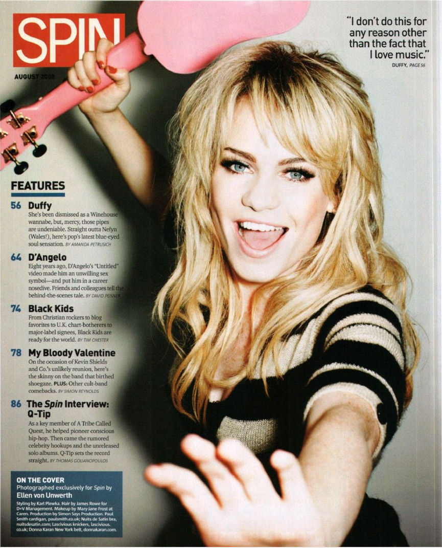
I would also consider to use this but unlike the previous one, this has a much more of a tighter focus on the main character with a slight blurring vignette. I love the pose that the main character has as well as the facial expression along with the incorporation of the prop. The rest of the contents is very clean and structured which is in stark contrast to the person.

I would consider using this idea of having a medium shot of the character but instead of covering the entire page, he is restricted to a small square of the page, which he is actually coming out of and over lapping the contents page title. This is very surreal and fits with our plot line.
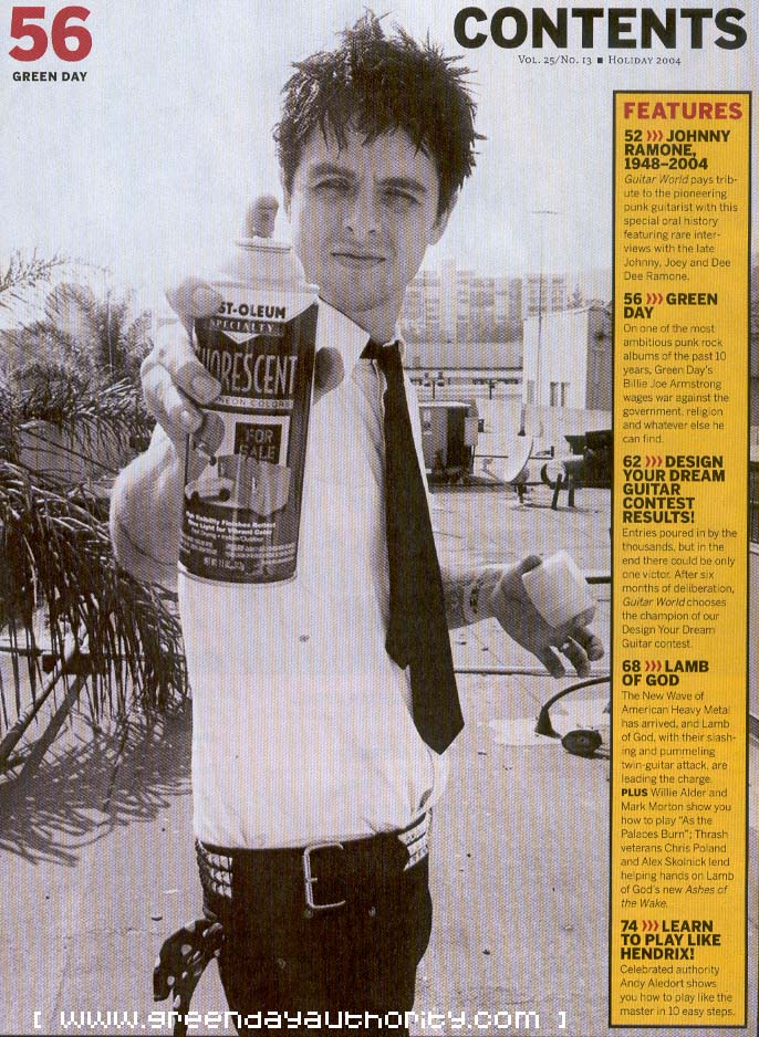
This is very unique again as the main character takes up the entirety of the page, holding a prop aimed directly at the camera which I would consider using as I think it is very effective in grabbing the audience and making them feel as if they are in the scene themselves. However, the contents page is coloured in contrast to the black and white and also stands out.
Planning
1) Create a spider diagram or bullet point list of all the things your target audience might be interested in. How can you use this information to create a main feature about your film that will appeal to your target audience?
- Our genre is going to be focused on a suspenseful, drama/thriller. There will need to be an idea of violence and blood iconography especially considering the rating
- Our target audience are teenagers and young adults so the style and design must be trendy but also clean yet simple as many people don't like to be overloaded with information.
- The main character must be displayed as this will engage the audience
- The writing must be clear and concise but not long as if it were an essay which will not at all anchor the audience and if it does it will probably bore them.
- The images of the feature will have to be dramatic and fit the tone of the plot line.
- LOGO - Watch Dogs
2) Produce an A5 sketch of your front cover including the key conventions and design tricks you have studied in existing programmes and then planned in planning task 1 above.

3) Produce an A4 sketch of your double-page spread contents page. In terms of the text for your contents page, you will need to find out the names of the films of other groups in your class. The other films in the class will make up the rest of your contents page.

4) Create a spider diagram or bullet point list of ideas for your double-page spread feature. Write a list of potential headlines and sub-headings for the article you choose to go with.
- Spin the wheels of fate
- This life is an illusion
- Fulfil your darkest intentions
- The main feature will focus on our script and the general idea
- Also it will focus on the concept and the crew behind the film. Sort of like a Behind the Scenes
5) Produce an A4 landscape sketch of your double page spread design now you have chosen the subject matter.

No comments:
Post a Comment